We are specialists in quality batteries. We have batteries, chargers and accessories for everything you can think of. Low prices, big inventory, expert advice. Find your battery here!
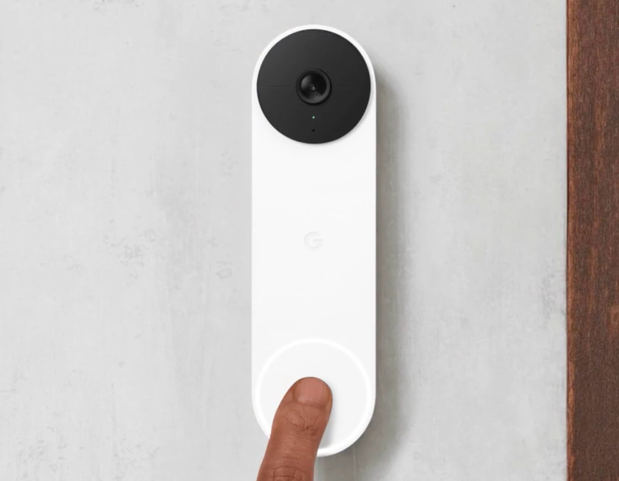
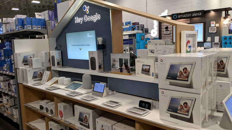
Anyone using a Nest Doorbell or a surveillance camera from Google’s subsidiary will have to pay 25 to 33% more for the corresponding Nest Aware subscription, which is almost indispensable for using the cameras.
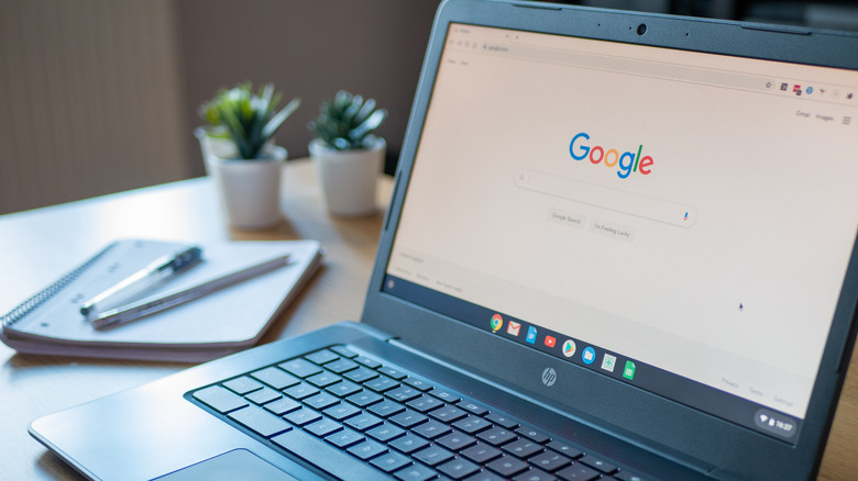
Anyone using a Nest Doorbell will have to purchase a more expensive subscription in the future. (Image source: Google)
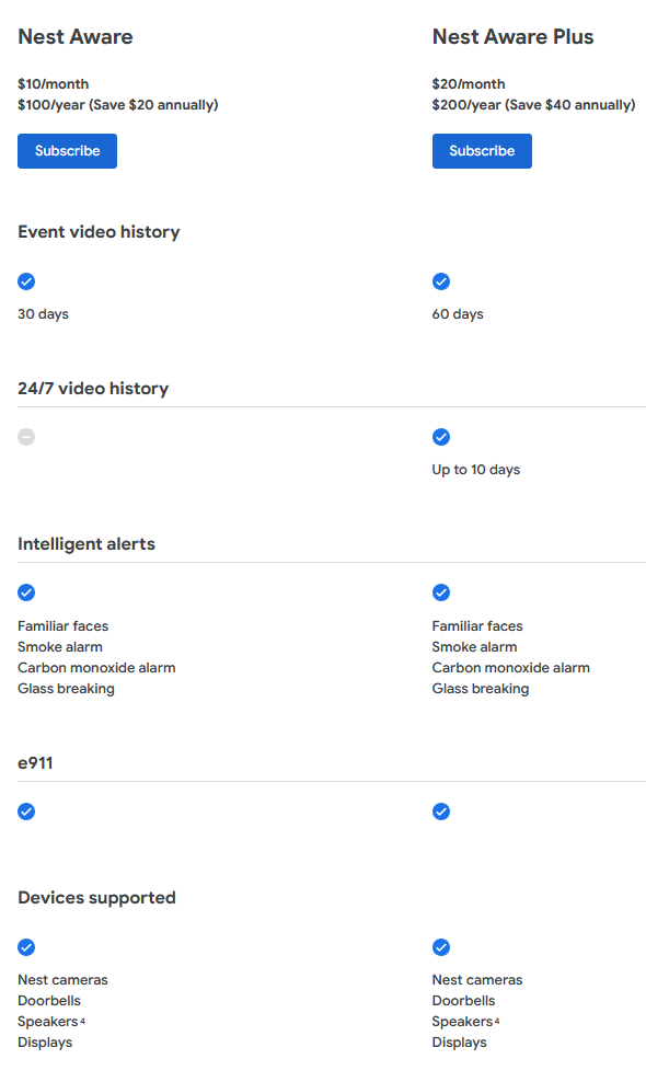
The popularNest Doorbelland Nest security cameras are only truly useful in conjunction with the Nest Aware subscription. This subscription unlocks, among other things, event-based notifications and allows video clips to be saved for 30 or 60 days, depending on the subscription. The more expensive subscription even includes 24/7 video history for supported cameras for the past ten days. Those who don’t subscribe can only save video clips from the past three hours.
While Nest Aware cost $6 two years ago and $8 per month a few days ago, Google has now increased the price of the cheaper of the two subscription options to $10 per month or $100 per year – a price increase of 25%. Anyone who wants to save 60 days of video history instead of 30 and needs access to continuous recordings of the past ten days will now have to pay $20 per month (instead of $15) or $200 (instead of $150) per year, a 33% increase. Google stresses that this subscription only needs to be paid once, regardless of how many cameras are used.
Google once again demonstrates that customers should be more cautious than ever when purchasing products that require cloud access. Especially since there are alternatives that do not require a subscription or can use an existing subscription. For example, the Netatmo Video Doorbell stores video clips on a microSD memory card instead of the cloud, whilecameras from Eve Home, for example, use Apple HomeKit Secure Video, allowing videos to be stored in iCloud, which is sufficient for the cheapest iCloud subscription at $0.99 per month.
In true Google fashion, the tech giant is not afraid to terminate hardware devices when it feels they have run their course. In 2024, at least seven products entered Google’s graveyard, including the Chromecast line of digital media players. In 2025, the Mountain View-headquartered company has once again put two well-loved devices on its chopping block — the Next Protect Smart Smoke and CoAlarm and the Nest x Yale Smart Lock.
Google announced the discontinuation of the smart home devices in March 2025, saying the move is part of a broader initiative to build “a platform that all device makers and developers can use to spur innovation in the home.” In other words, it is narrowing down its existing lineup of hardware while doubling down on its more modern ecosystem. This comes on the heels of the sudden demotion of Google Assistant to make way for Gemini on most mobile devices. Then, there’s the addition of new features on the Google Home app, designed to change the way users connect the hub app to their smart devices. Unbeknownst to many, the update leaves behind older devices that still heavily rely on the legacy Nest app, which appears to be on its last legs.
Even before the announcement, there was a foreshadowing about the fate of the two smart home devices. Discussions on Reddit revealed that the Nest Protect had been increasingly difficult to purchase for months, with the Google store limiting orders to just one unit per customer.
Devices replacing the Nest Protect and Nest x Yale Lock
While the discontinuation and changes may feel like the end of an era for Google’s 2010s tech, the tech giant gave assurance that it is still committed to providing consumers with a streamlined and intelligent smart home experience. The company even announced two new devices that will replace the outgoing Nest Protect Smart Smoke and Nest x Yale Smart Lock.
Through a collaboration with First Alert, Google is rolling out the First Alert Smart Smoke & Carbon Monoxide Alarm. Scheduled to launch in North America sometime in late 2025, the new alarm system will be compatible with both the Google Home app and existing Nest Protect devices. Meanwhile, Google is once again partnering with Yale for its next-generation smart lock, called the Yale Smart Lock with Matter, which is arriving in summer 2025.
The new smart lock has big shoes to fill, considering the Nest x Yale Smart Lock landed our top picks for smart lock brands in 2024. Like the outgoing device, the new smart lock offers keyless entry and remote access. But unlike its predecessor, it will work across all Matter-enabled ecosystems, including Apple Home, Amazon Alexa, Samsung SmartThings, and Google Home.
The new devices will come at a time when Google is still sorting out its smart home ecosystem. Their compatibility with Nest Protect will give the platform a lifeline for the time being. As such, Nest Protect devices will continue to receive software and security updates.
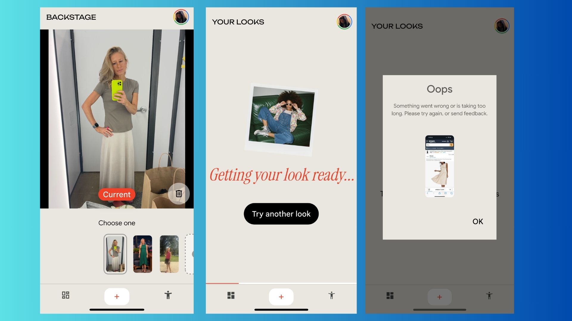
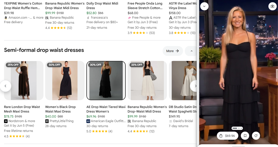
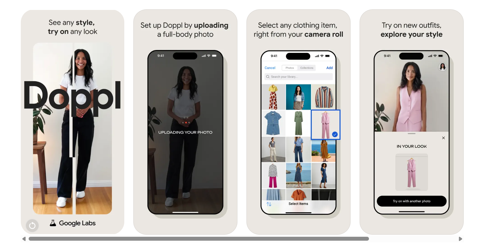
It seems likeGoogleLabsis launching anew AI toolnearly every week, and this week is no different. Google just launchedDoppl, a free experimental app (currently U.S. only) that takes shopping to the next level by letting users see virtually how the clothes will fit.
Gone are the days of browsing static model images, that may or may not resemble your own body. Now you upload a full-body photo and see how clothes fit on you and — get this — even move, on you. And it’s all powered by AI.
Shopping online and see something you like? Just open the app and follow these steps:
Upload or snap: Choose a photo of yourself. A full body shot is recommended. Then, pick out an outfit fromInstagram, a website, or even an online thrift store catalog, and Doppl overlays the garment onto an animated version of you.
Motion simulation: What makes Doppl different is that, instead of a flat image of you “wearing” the outfit, the app creates a short AI-generated video that shows how the clothes might drape and move as you walk or turn
Save and share: Still deciding if you want to buy? Save your favorite virtual looks or send the AI-generated clips to friends via social media
Google already offers a “Try On” feature in AI Mode Search, but that shows clothing on a static image of yourself and only works within the browser.
Doppl gives users a more realistic preview because you get both the visual accuracy and the added realism of clothing movement—making it feel more like an in-store fit.
Doppl is better than guessing as animated previews help users assess fit, style and flow before buying. Designed for today’s shopper who loves sharing on social media and discovering thrift finds, there’s now no need for users to track brand listings.
Plus, it’s fun and free to use. Now available in the U.S. on iOS or Android, no subscription is required.
How to try it
DownloadDopplfrom the U.S. App Store or Google Play. Upload a full-body photo or use the built-in AI model. Upload outfit images from your gallery or screenshots. Preview the animated look—and save or share your favorites.
Remember, as with any experimental AI app, it’s not perfect. Google warns that fit and visual details might not always be accurate.
Google has mentioned that it intends to expand it internationally, and future updates will likely include more fashion categories, better movement fidelity and refined image-processing algorithms.
Ironing out some wrinkles
Doppl is still in experimental mode, so don’t be surprised if things don’t run smoothly. Some examples of problems I ran into included lagging, glitching or not completing the request at all.
New users may encounter bugs; even uploading a photo of yourself can sometimes trigger an error message.
To improve your experience, try uploading multiple full-body images to give the app more to work with. It also helps to have a few screenshots of outfits ready when you start, so you can jump right into trying things on without delays.
What about privacy?
To power its virtual try-on features, Doppl uses your photos, which may raise eyebrows for some users.
According to Google, the app collects and uses this data to improve its services while applying privacy safeguards to protect user information.
While Google says your data is handled responsibly, it’s worth noting thatany app requiring photo uploadsshould be approached with awareness, especially when personal images are involved.
The takeaway
If you’ve ever wanted to see how a thrifted jacket or an influencer’s outfit might look on you, Doppl’s AI-powered videos offer a surprisingly realistic solution.
It’s a smarter, more personal spin on Google’s Search ‘Try On’ feature — and all you need is your smartphone and perhaps a sense of humor, because it might not always look perfect.
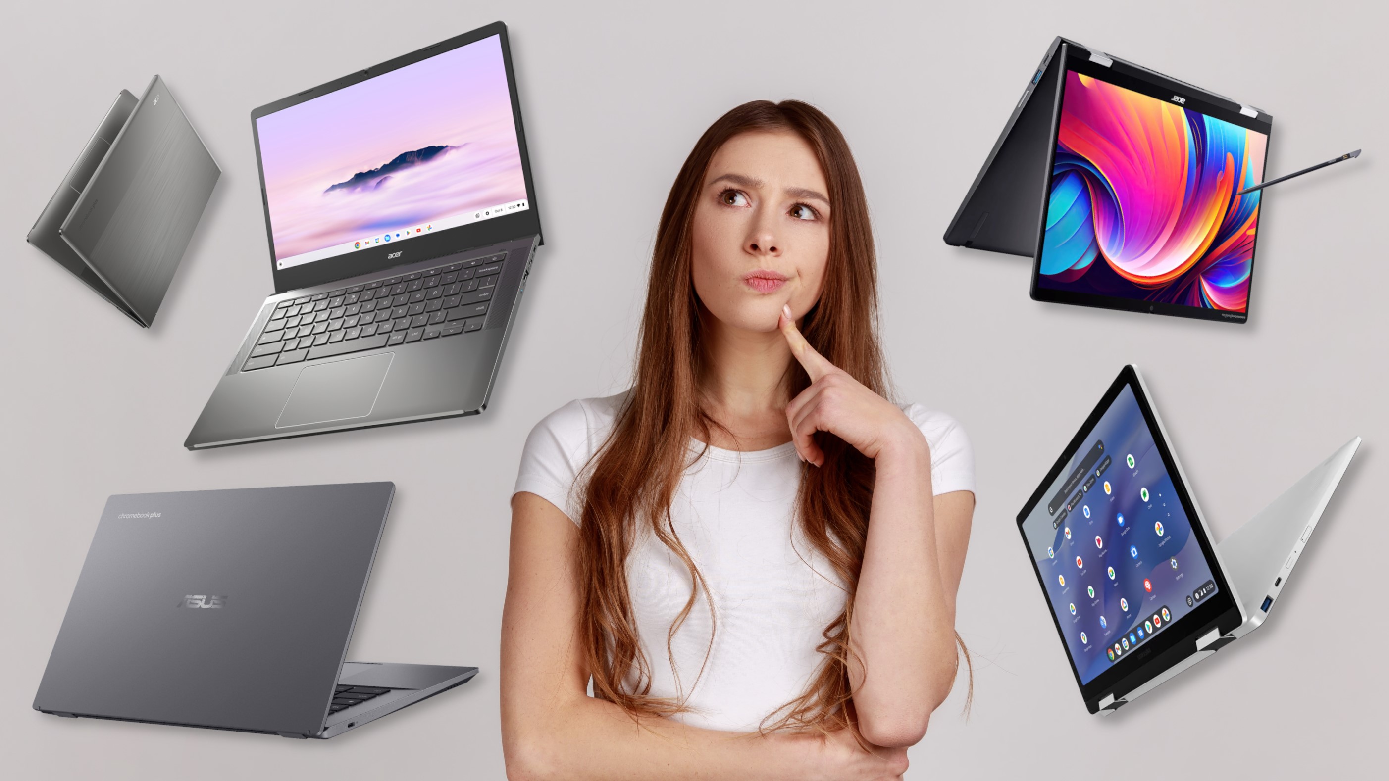
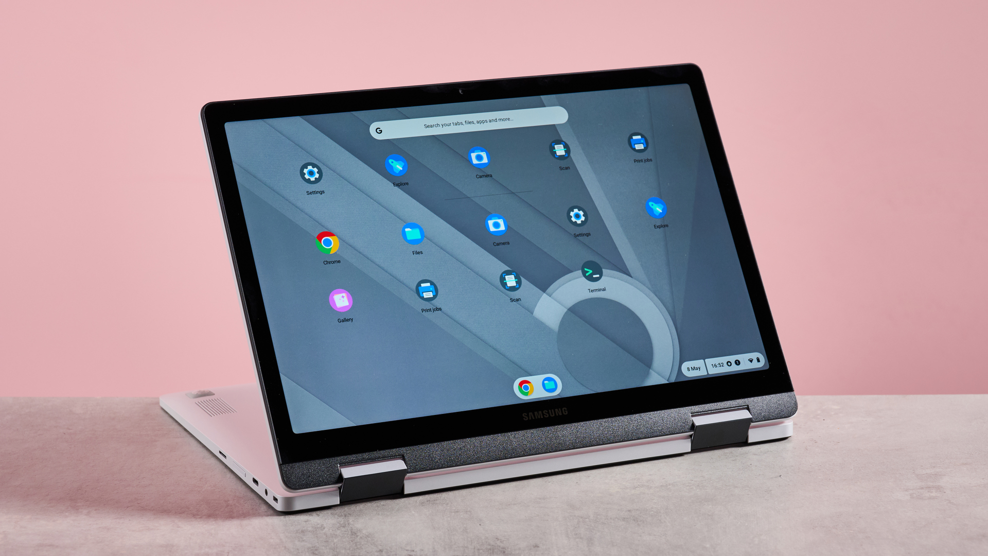
If you’re currently a student, or about to head off for high school or college for the first time, there’s a good chance you’re considering getting one of thebest Chromebooks. These Google-powered laptops are a great choice for learners on a budget, offering a sleek and easy-to-use OS at a sensible price point.
But now there’s also the Chromebook Plus lineup: a new tier of ChromeOS laptops that lays down baseline performance and design standards to deliver a more premium-feeling Google laptop experience. And there’s no denying that these new Plus laptops sit among thebest laptops for studentsright now.
Naturally, Chromebook Plus models are more expensive than conventional Chromebooks. So, considering how cheap some Chromebooks can be, is it really worth spending extra for the hardware upgrade, especially if you’re on a budget? In this article, I’ll dig into the pros and cons of the Plus format and hopefully help some budding students find the perfect laptop for them.
As you might expect, the Chromebook Plus standard has certain minimum hardware specs to meet Google’s requirements. That translates to better performance on average against ‘regular’ Chromebooks – but there’s an important catch here.
See, ChromeOS is designed to run with a permanent internet connection and offloads a lot of its processes to the cloud. For example, instead of usingMicrosoftWord and saving files directly to your laptop’s local storage, you’ll be using Google Docs and saving them in the cloud with Google Drive.
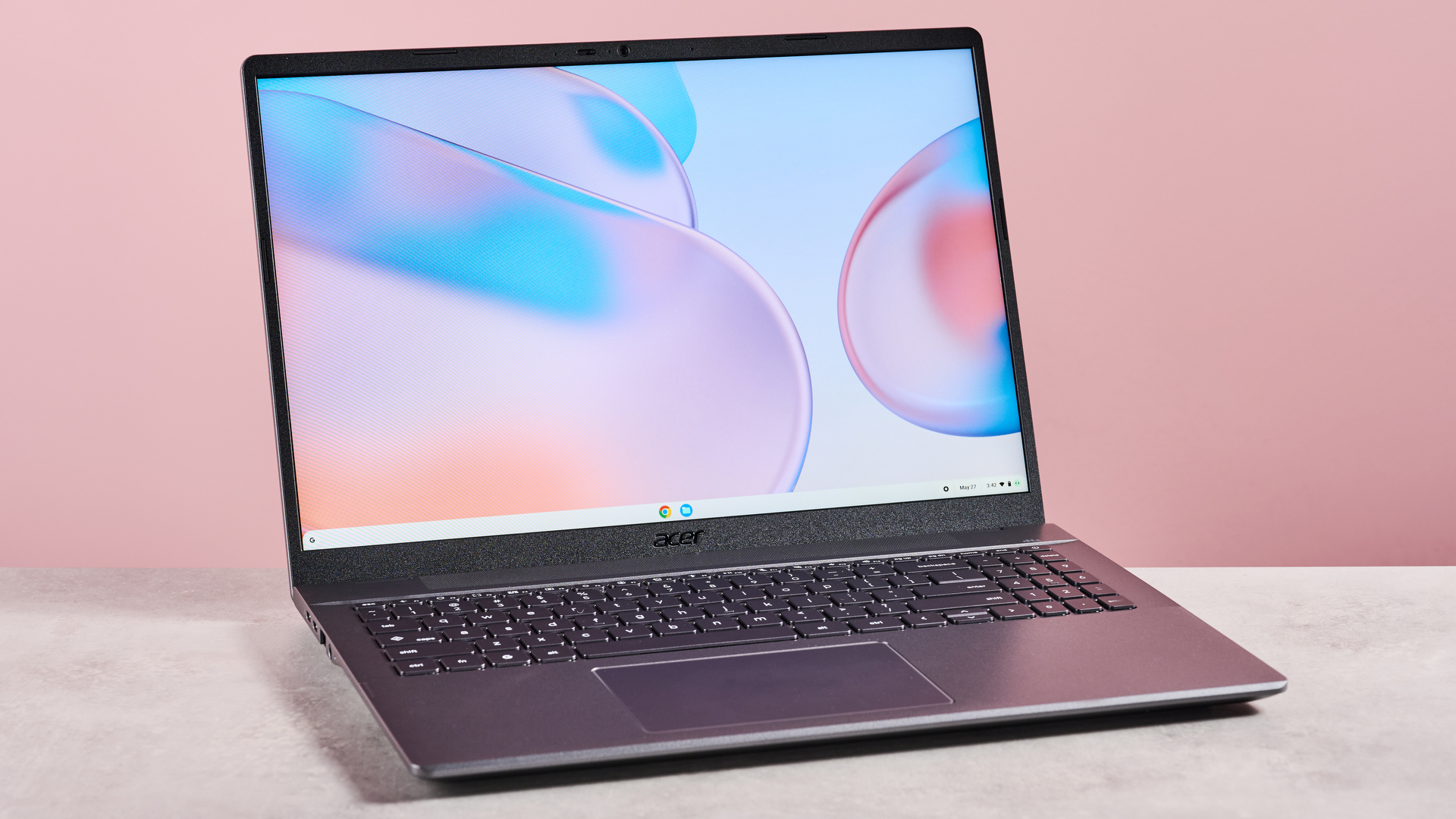
This is a double-edged sword. The lightweight nature of ChromeOS allows Chromebooks to be made with less powerful (and more affordable) components, but it also reduces the effective performance upgrade headroom and ties your performance to the speed of your internet connection. If you don’t have high-speed Wi-Fi, bear in mind that paying extra for a more powerful Chromebook, like theAcer Chromebook Plus 514, won’t necessarily translate to significantly faster performance.
The Acer Chromebook Plus 514 exemplifies what a Chromebook should be, and it’s much better value than a Windows laptop or MacBook, too.
Still, Plus models have other advantages. More RAM means you’ll be able to multitask more effectively, so if you tend to keep 20+ browser tabs open at once or multiple programs running simultaneously, it’s a worthwhile upgrade. You also get at least 128GB (often more) of drive space with a Chromebook Plus. This isn’t always needed, due to the cloud-based nature of ChromeOS, but will come in handy for users who want to install lots of programs.
Lastly, Chromebook Plus laptops are designed with Google Gemini in mind. In other words, these laptops are a bit better suited for running AI features, although, again, a lot of this functionality is offloaded to cloud computing, so don’t expect to see a tremendous difference.
There’s no escaping the fact that some Chromebooks do simply look and feel cheap. If you’re picking up a super-budget model for under $300 / £300 / AU$500, chances are it’s not going to look anything like a premium device.
That’s not the case for Chromebook Plus laptops; the higher price does mean you’re getting a product that feels a bit higher-end. Sure, they might not look quite as fancy as thebest ultrabooks, but it’s a noticeable upgrade.
Then again, it’s a hill I’ll die on that people shouldn’t be concerned with how their hardwarelooks– that’s how you end up with overpriced tech. What’s important is how itfeels,and a Chromebook Plus is invariably going to feel a bit better to use than a budget Chromebook. The specifics of this may vary. A more comfortable keyboard, a more robust and sensitive trackpad, a sturdier outer chassis, or an improved port selection; there are lots of possible improvements to be found here.
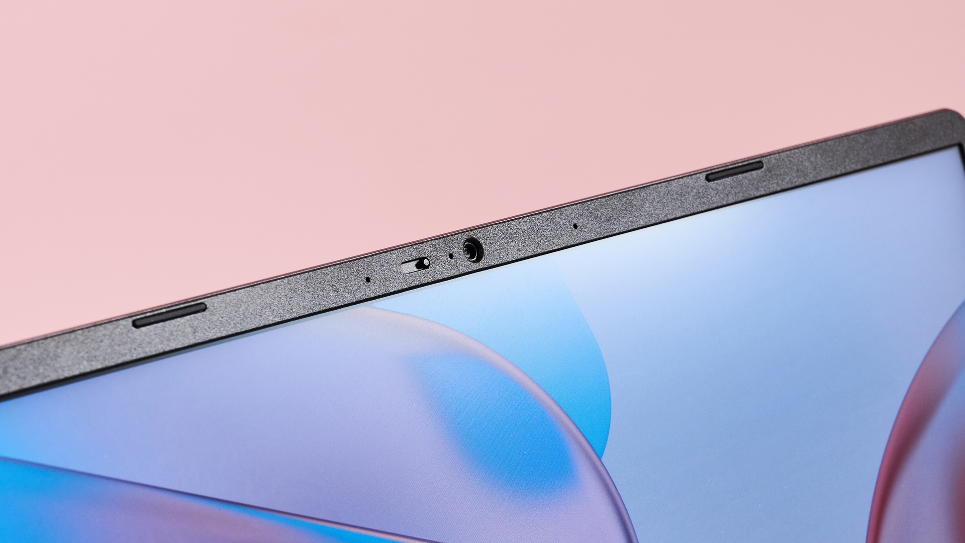
A Chromebook Plus is guaranteed to have a Full HD webcam – great for remote learning, or video calls with family while you’re away at college.
There are two key factors mandated by Google for a laptop to receive the Plus badge: display and webcam. The screen must be a minimum of Full HD 1080p resolution, and the webcam must capture video in 1080p.
While 1080p is widely considered to be the ‘baseline’ for Windows laptops, you’ll find plenty of cheap Chromebooks out there still rocking a lower resolution (most commonly ‘HD Ready’ 720p). Considering that most entertainment media these days is available in Full HD (or better!), it’s worth considering a Chromebook Plus for its superior display if you like to kick back and watch Netflix on your laptop after a day of studying. The boosted webcam resolution is also a nice addition for students who have remote classes using software like Zoom.
When not to pick a Chromebook
I think Chromebooks are an excellent alternative to a Windows or macOS laptop for any user who wants good value for money, but there’s an important caveat to bear in mind here: software compatibility.
Simply put, not everything you can run on a traditional Windows laptop will be available on ChromeOS. You do get a decent selection of native apps, and Google has also made the AndroidGoogle Play Storecompatible with Chromebooks. Still, some software may not be compatible, so if you plan to use specific programs, be sure to check in advance whether they’re available on ChromeOS.
As great as Chromebooks are, ChromeOS does have some limitations when it comes to software compatibility.
It’s also important to consider the topic you’re studying. Some courses will be better served by a more powerful laptop capable of handling more intensive local workloads. For example, if you’re in a creative discipline like 3D digital art or video editing, you might be better off with a laptop that has a dedicated GPU fromNvidiaorAMD, which is something that Chromebooks universally lack. If you’re taking literature or business studies, though, a Chromebook should suit you just fine.
If you decide that a Chromebook isn’t right for you, be sure to check out our list of thebest student laptops. Some of theseareChromebooks, but you’ve got some excellent alternative options like theDell Plus 14.
Chromebook vs Chromebook Plus: Closing thoughts
At the end of the day, thebest student Chromebookwill be a little different for everyone, depending on your needs and budget.
But having tested a large number of Chromebooks (both Plus and non-Plus) over the years, I feel quite comfortable saying that if your budget can stretch a little further, the upgrade is worth it. Having a faster processor and a better display is a worthwhile upgrade, and several Chromebook Plus models on the market cost less than $500 / £500 / AU$750 – a great deal considering how expensive modern Windows laptops can be, even just in the mid-range space.
Nonetheless, you shouldn’t be discouraged about buying a super-cheap Chromebook if you’re working with an extremely tight budget. I’d advise looking for a model with at least 8GB of RAM, but even with that criterion in place, you should be able to find something reasonably priced, like theLenovo IdeaPad 3i Chromebook. Whatever you choose, you can rely on TechRadar’s recommended product pages, as we never recommend hardware that we wouldn’t use ourselves.
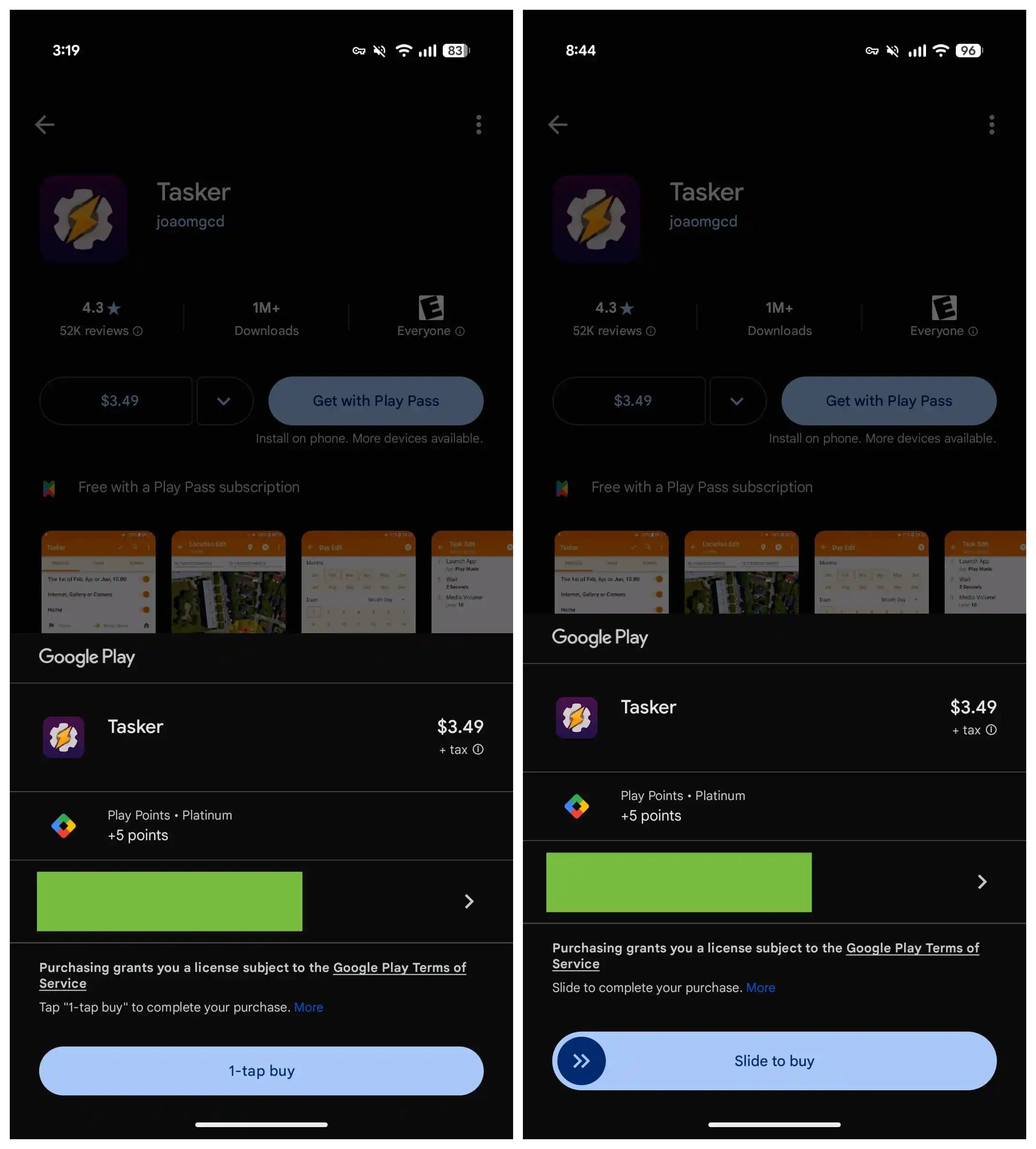
While manyAI services aim to replace appswith all-in-one solutions, the Google Play Store remains home tothousands of appson Android. While the Play Store offers easy access to free and paid apps, manyusers have accidentally purchasedpaid apps — especially with kids around. Google is now tweaking the purchase process on Android to reduce accidental purchases.
As spotted by9to5Google, Google is rolling out a change to the Play Store where purchasing apps now requires a “slide-to-buy” gesture to complete the transaction. Until now, the Play Store used a single “1-tap buy” button, which sometimes led to unintended purchases. This has now been replaced with a Slide to Buy pill.
You’ll have to slide instead of tap to buy apps on the Play Store now
Source: 9to5Google
Old vs. new app purchase UI in Google Play Store
The new pill features a circular button with two arrows pointing right, signaling users to swipe right to confirm the purchase. According to the report, there’s also a bounce animation to guide first-time users through this updated process.
Previously, users had to press two separate buttons to complete aPlay Storepurchase. Now, the added swipe action introduces slightly more friction to further prevent accidental purchases. The update is rolling out with version 46.5.19-31 of the Play Store, although I haven’t seen the change yet. Like many Google updates, this could be a server-side rollout that takes a few weeks to reach everyone.
In addition, Google appears to be testing several other changes on the Play Store. Just earlier today, the company was seen testing the new Material 3 Expressive design, and it recently rolled out the “Ask Play about this app” feature, which uses Gemini to answer user questions about an app.
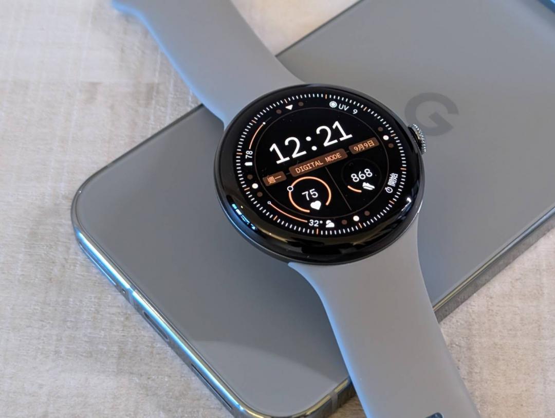
The Pixel Watch 3 will be in line for the new feature
Android earthquake alerts are expanding to Wear OS
The feature is supported on phones in 98 countries
It’s included in the latest Google Play services update
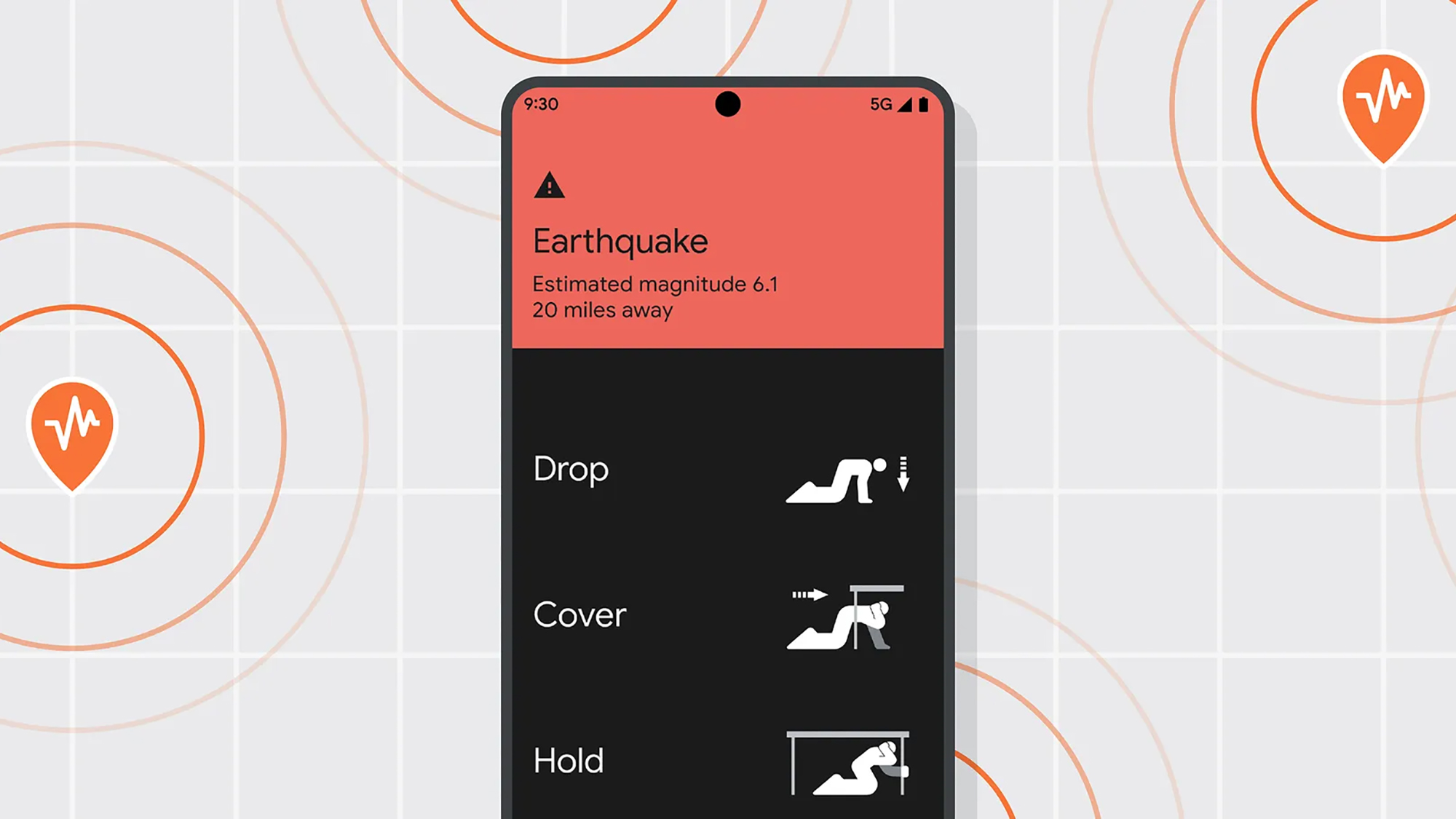
For several years now, Android phones have beenable to warn youabout an imminent earthquake, so you’ve got a few minutes to prepare yourself and those around you – and the feature is finally expanding to Wear OS smartwatches as well.
As per theJune 2025 release notesforGoogle Playservices (viaAndroid Authority), you’ll now receive “alerts on Wear when an earthquake is expected to cause shaking”. Google Play services is a separate update to Android, and should be applied to your phone and wearable automatically in the coming days.
It makes earthquake warnings much more useful for Wear OS owners, especially those who like to leave their phones in pockets and bags (or who have watches with cellular connections, and leave their phones behind completely).
Google hasn’t said anything else officially about the new feature, but presumably every smartwatch currently getting Wear OS updates is going to be eligible to get the early earthquake warning functionality as well.
How earthquake alerts appear on Android phones(Image credit: Google)
We don’t know exactly how this will look on thebest Android watches, but we know how it works on phones. Google gets its data from seismic sensor reports, as well as anonymous accelerometer measurements frombillions of Android phones.
Expected earthquakes with a magnitude of 4.5 or greater trigger an alert: you’ll be given the estimated magnitude and the distance to the epicenter, which pop up on screen, and you can tap on the alert for more information.
If significant shaking is expected, the alert will ignore any volume and Do Not Disturb settings on your phone, and play a loud sound. You’ll be given advice on screen about how to best protect yourself against the coming quake.The Android Earthquake Alerts System is currently active in 98 different countries around the world, and you can check the list here. On Pixel phones, the alerts settings can be found under Safety and emergency in Settings.
It will also show you their location, weather and more.
Google
Google is officially letting you prioritize certain people in your life. The company has launched Pixel VIPs, an update that allowsGoogle Pixelowners to “stay connected to the people who matter most and never miss a moment from them.” It expands on Google’s existing favorite contacts option,9To5Google reports.
GDHB7 Battery for Google GDHB7
Tapping from the homescreen widget or inside Contacts takes you to a fullscreen feed. You get their profile image and contact options (calling, messaging, and WhatsApp). A card notes any upcoming birthdays, while there’s also:
Last connectionthat lets you “see your last call and message with them”
TheLocation updatessection offers a map with “their real-time location, as well as weather and time
You can make one-offNoteswith a card-based UI like Google Keep
Finally, there’sThings to do togetherwith “activity suggestions”
“Tell us what you like to do together: Get better activity suggestions by adding your preferences”
Pixel VIPs includes features such as placing your “VIPs” at the top of your contact list and letting them bypass your device’s do not disturb. If you click on a specific person then you can see their real-time location, weather and time. It also shows the last time you two connected. Plus, Google will suggest things for the two of you to do together based on your preferences.
You also have the option of adding notes to their contact page. These tidbits might include their new dog’s name, when they’re traveling or a reminder of your plans together.
The possibility that Google was working on this update first arose last summer under the name “besties,” rather than “VIP.”Reports from9To5Googleshowed it replacing thefavorite contactsoption but didn’t reveal much else.
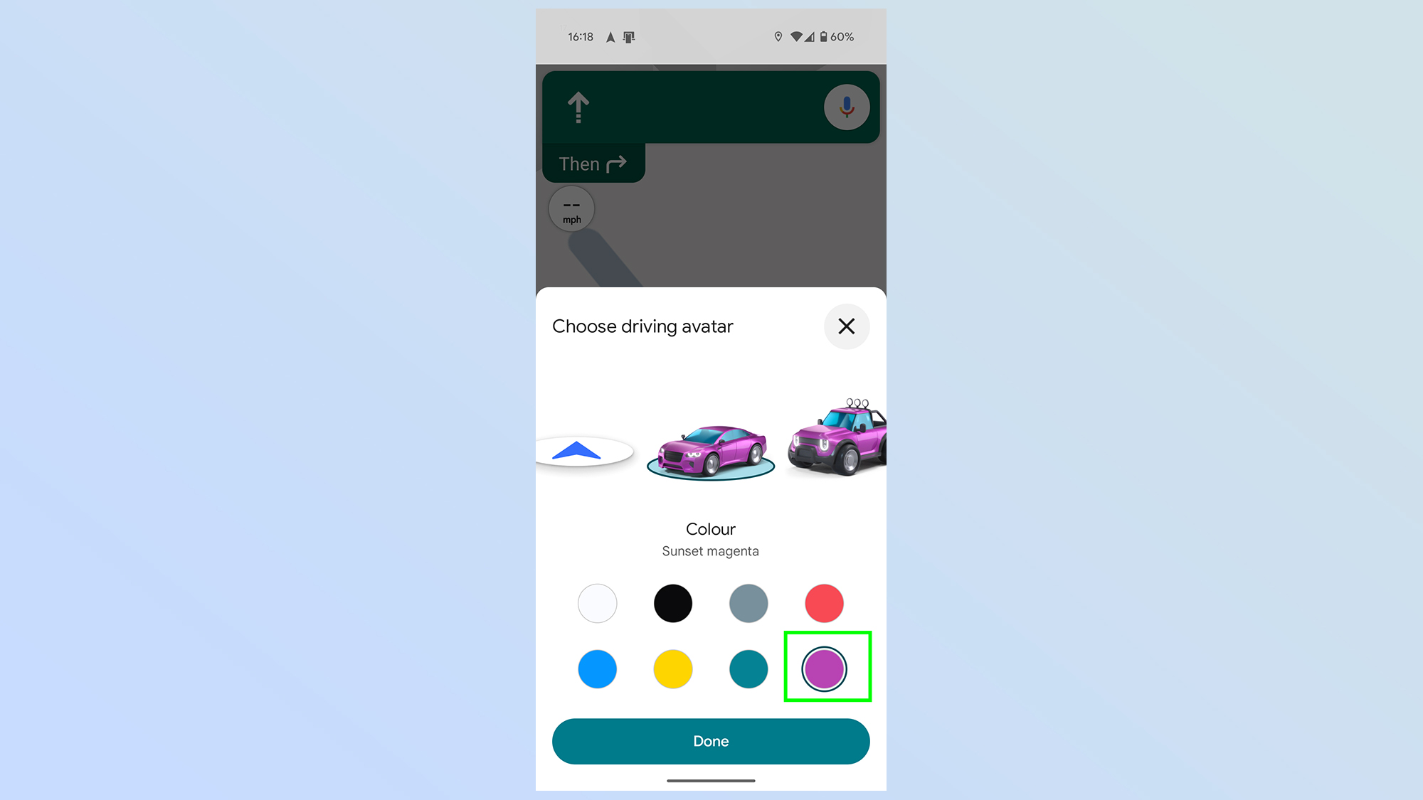
When you’re driving around on Google Maps, whether you’re an Android or iPhone user, you’ll always be represented on the map with the boring default arrow icon.
But what if I told you that it doesn’t have to be that way? Because you can change the look of your avatar, and Google’s just released a bunch of new options.
In the past Google only offered 3 alternate options, 3 colorful vehicles to mix up your navigation screen. Now, though, Google’s updated Google Maps to offer 5 more options — each available in one of 8 colors. Though it isn’t quite so easy to figure out how.
Here’s how to customize your car icon in Google Maps on Android and iOS.
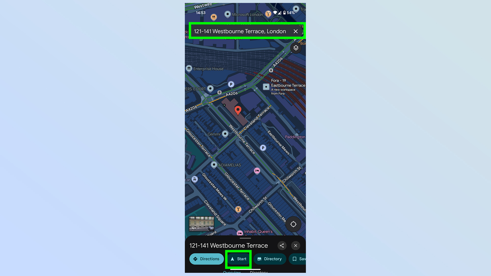
The first thing you need to do is start navigation. It doesn’t matter where to, or if you even plan to go, just find a location with the search bar, thentapStart.
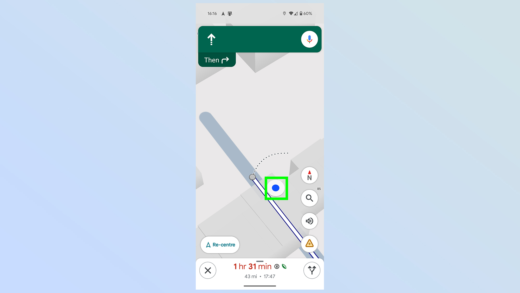
The arrow icon in the center of the screen is your user icon, and the next step is totap it.It may sometimes appear as a large white dot with a blue center
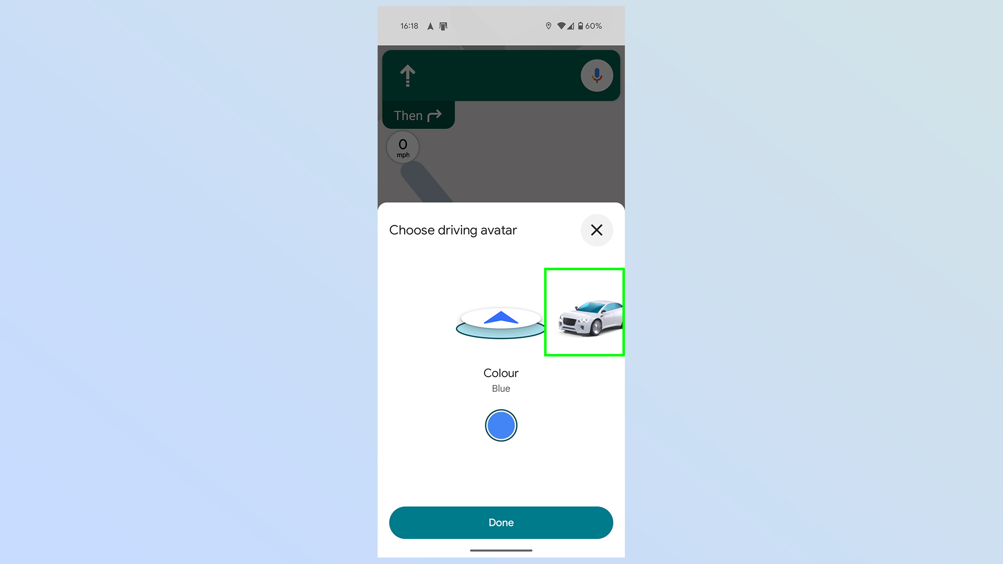
3. Pick a new car icon
You’ll then see a pop-up menu showing off different icons you can use — including the arrow and a bunch of different cars.
Simply scroll left and right until you find the avatar you like, andtap it.
The benefits of using cloud storage over local storage are significant. For starters, you can get to your files from just about anywhere. And as long as you’ve set up account recovery, there’s little chance of losing them. But which cloud service should you use? While there are plenty of reliable options out there, Microsoft OneDrive and Google Drive are two of the most popular. That’s mostly because of their reliability and wide range of features.
Microsoft OneDrive and Google Drive have a lot in common when it comes to features, ease of use, and security. You can access both services on most operating systems, including Android, iOS, Windows, and macOS. Both of them also offer comparable file-sharing and collaboration options. If you use a premium plan, you get access to AI-powered features through Copilot or Gemini, built into their respective productivity suites.
The biggest difference between the two is how much free storage they offer. Google Drive gives you 15GB of storage, while OneDrive only includes 5GB on its free plan. This, of course, makes Google Drive look like the better choice at first glance. But if you’re thinking about upgrading to a paid plan, OneDrive has its advantages, too.
For extra storage on OneDrive, you have to sign up for a Microsoft 365 plan. With Google Drive, additional storage comes through a Google One subscription. Both services offer a basic 100GB plan for $2 per month, so there’s no price difference at that tier.
If you’re looking for more space, though, Google One has a 2TB plan for $10 a month. For the same amount, Microsoft offers only 1TB of storage. That said, the Microsoft 365 Family plan is a better deal if you plan to share the subscription. For $12.99 a month, you can share the subscription with up to six users, and each person gets their own 1TB of storage. Google One also supports sharing with up to five others, but the 2TB is shared across users.
OneDrive also makes sense if you already use Microsoft Office apps for work or school. That’s because a Microsoft 365 Personal or Family subscription includes access to Word, Excel, and PowerPoint. Plus, all your documents are automatically saved to OneDrive. You also get Clipchamp, which is a great video editing tool if you’re into that kind of thing.
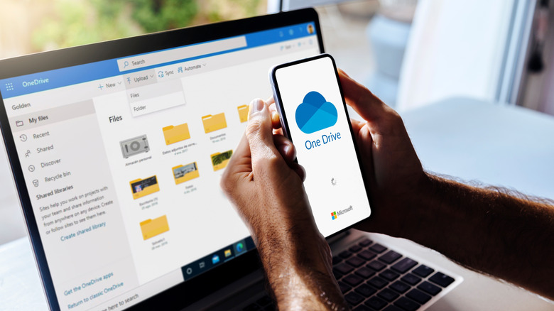
Choosing OneDrive is also a smart move for Windows users. Once you sign in with your Microsoft account, you can easily back up all your files and manage them through File Explorer. While it’s possible to add Google Drive to Windows for a similar setup, OneDrive offers better integration since it’s built by Microsoft.
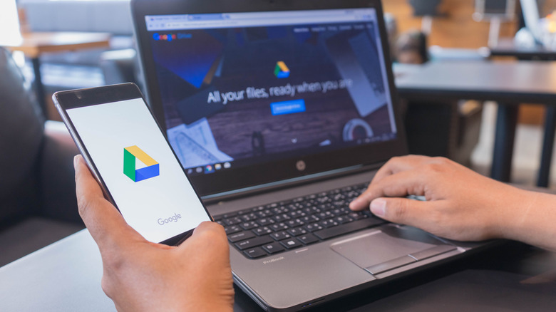
Google Drive isn’t a bad option either. In fact, for some, it might make more sense than OneDrive. For instance, if you’re sticking with the free plan, Google Drive’s 15GB of storage is far more generous. And if you’re already into Google’s ecosystem and prefer using Gmail over Outlook or Google Docs over Word, using Google Drive makes it easy to manage and share your files.
When you’ve thousands of files stored in the cloud, a good search function can make all the difference. That’s where Google Drive shines with its advanced search filters. For instance, if you search for a document, it also shows files containing the word you searched for, which can be useful when you don’t remember the exact file name. In comparison, OneDrive’s search feature feels more limited.
Finally, if you mainly want cloud storage for photos and videos, Google Photos is a big plus. It works on Android, iOS and the web, and having a dedicated app just for managing your media makes everything a lot simpler. You also get to use all of Google Photos’ best AI features. Microsoft, on the other hand, doesn’t offer a separate app for photos and videos, so you have to manage everything through the main OneDrive app.
Ultimately, you really can’t go wrong with either service. It mostly comes down to the devices you use, your storage needs, and whether you prefer Microsoft or Google’s ecosystem.
ChromeOS and Android are often mentioned in the same breath, which has a lot to do with them both being part of Google’s vast mobile and digital ecosystem. But while they share common DNA, including access to the Google Play Store and integration with services like Gmail, Google Drive, and Google Assistant, when you go beyond those basics, the two start to go their separate ways. While it’s true that the two can both run Android apps and have some things in common behind the scenes technology-wise, they’re built for different tasks, look different, and work in very different ways.
If you own or have ever used a budget-friendly laptop like the Acer Chromebook Plus 515, you’re familiar with Google’s lightweight ChromeOS operating system. Unlike Windows and macOS, ChromeOS is a cloud-based operating system that emphasizes the use of web applications and services, with Google’s unique Chrome browser acting as its primary interface. In contrast, Android is an operating system designed for mobile devices. All of that tapping, swiping, and pinching you do on your non-Apple smartphone or tablet, Android makes it possible.
What’s important to keep in mind is that these differences aren’t just technical; they affect how each system fits into your daily life. ChromeOS is built for getting things done on a laptop, while Android is made for using your phone or tablet with taps and swipes. While it might seem like these systems could be interchangeable, they’re built for different types of devices, and for most people, there’s really no good reason to use ChromeOS on a phone or Android on a laptop.
ChromeOS is built for productivity and cloud-first computing
Using ChromeOS for the first time takes a little bit of getting used to because it doesn’t work like traditional operating systems, which rely on programs the user has to install and traditional file systems. Instead, ChromeOS is built around the Chrome browser, which means that as the user, you can get everything done using web apps and store most of your work in the cloud. With ChromeOS, you can download Android apps from the Google Play Store, and on many Chromebooks, you can even run Linux apps, something that gives users a lot of choice when it comes time to get things done.
The design of ChromeOS makes it an especially good match for those whose primary work involves document editing, web browsing, and other productivity activities. ChromeOS’ simplicity is what sets it apart from other operating systems and makes it a favorite in schools and among those looking for an inexpensive laptop that’s easy to use and doesn’t come with a bunch of unnecessary extras.
Google’s cloud is an integral part of the ChromeOS setup and makes it easy for users to access their files and applications from any device with an internet connection. ChromeOS includes built-in access to Google Workspace tools like Docs, Sheets, and Slides. While these apps are also available in any browser, ChromeOS offers tighter integration and native offline support that can make them easier to use on a Chromebook. All of these things are what make ChromeOS a better fit for users who need a simple, secure laptop for everyday tasks.
Android is tailored for touch-centric mobile devices
Even if your primary smartphone is a non-Android model, like the Apple iPhone 16e, chances are you’re at least somewhat familiar with Android and have used an Android-based device a few times. Unlike ChromeOS, which was developed for use with computers, Android is an operating system designed for smartphones and tablets. So it’s not too surprising that its interface is optimized for touch-based interaction, and it comes with many customization options. Android supports a wide range of apps available through the Google Play Store, covering everything from communication to entertainment.
While there’s no arguing that Android devices do excel when it comes to portability and app diversity, you may find them lacking when compared with the productivity features that ChromeOS offers. For example, Android’s file management and multitasking capabilities don’t come close to the desktop-like environment on ChromeOS devices. That doesn’t make Android worse; it’s just that Android prioritizes different things.
Since it was designed with mobile devices in mind, it focuses on the intuitive touch interactions that make smartphones and tablets so easy to use. This is what makes Android ideal for on-the-go use, casual entertainment, and communication on smaller touch-based devices. On the other hand, ChromeOS looks and feels more like a traditional computer, with a taskbar and the ability to open apps in separate windows, which can make it easier to get work done.
 (Image credit: Google Labs)